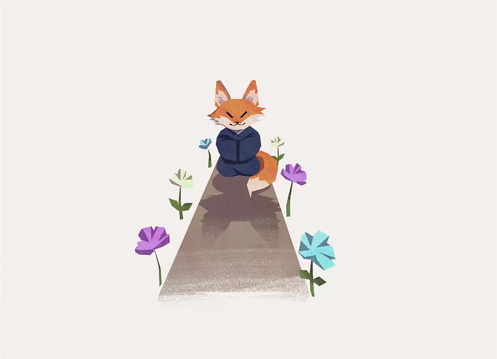
I researched the Enneagram personality types and wrote down the main characteristics of each personality type. Essentially I created my own version of the Enneagram personality test. I wanted each type to be humorous and make my users laugh, even if there were negative characteristics.
RESULTS CHARACTERISTICS
Type 1 - The Perfectionist
- wake-up and grind
- “you’re doing that wrong”
- “erm actually...”
- will tell you if there is something in your teeth
- if you need something done, they are the guy
- speed reading master
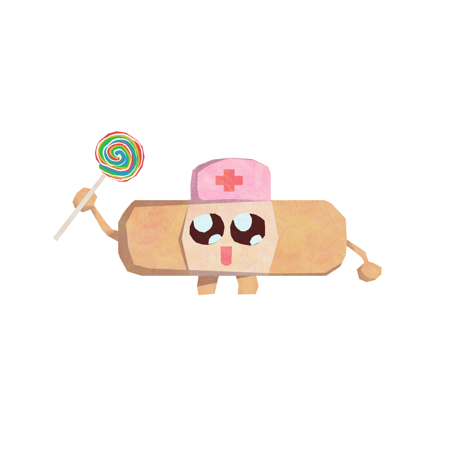
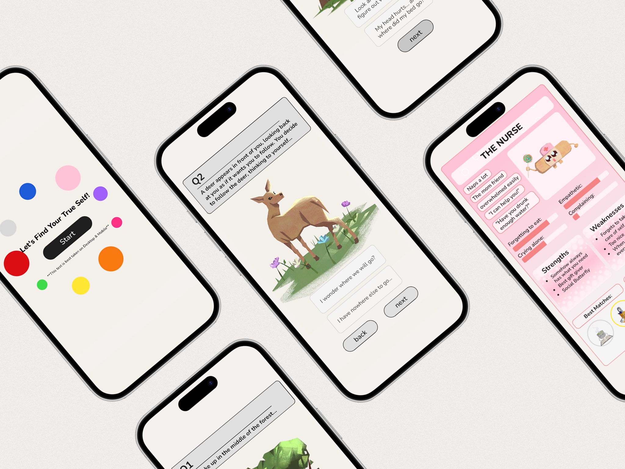
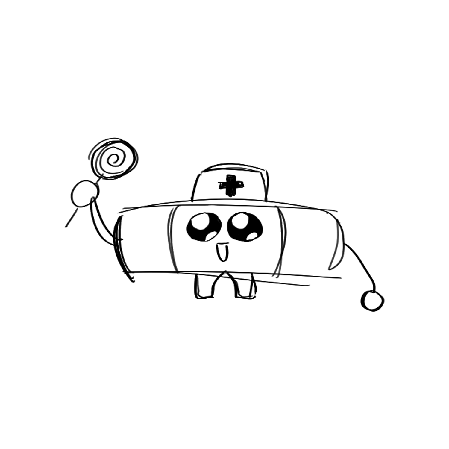
Type 2 - The Nurse
- mom core
- did you drink enough water?
- I’ll help!
- Always has the item you were looking for
- Amazing gift giver
- Social butterfly
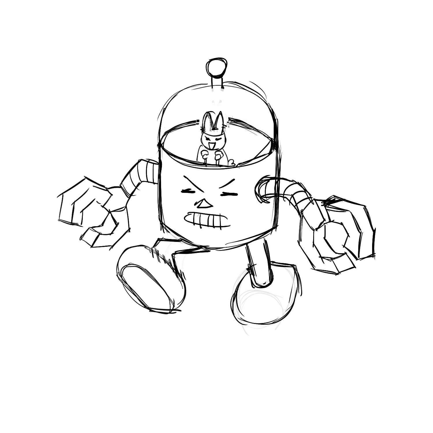
Type 3 - The Mastermind
- Smiles while plotting your downfall
- I have to be better than everyone
- "Why not me?"
- Crafty
- Determined
- Always wins at baking competitions
Type 4 - The Hermit
- "Do we have to?"
- "ohhh that looks pretty"
- let’s go to a cafe!
- decor master
- a natural at most hobbies
- pretty lucky
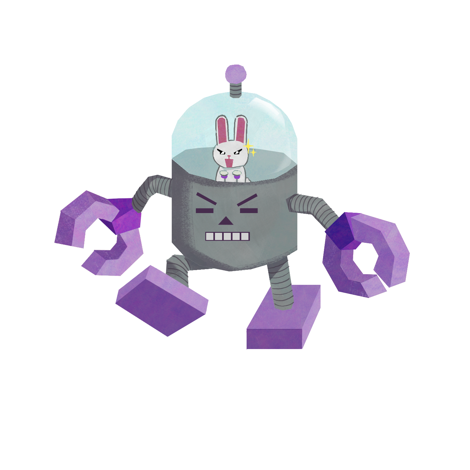
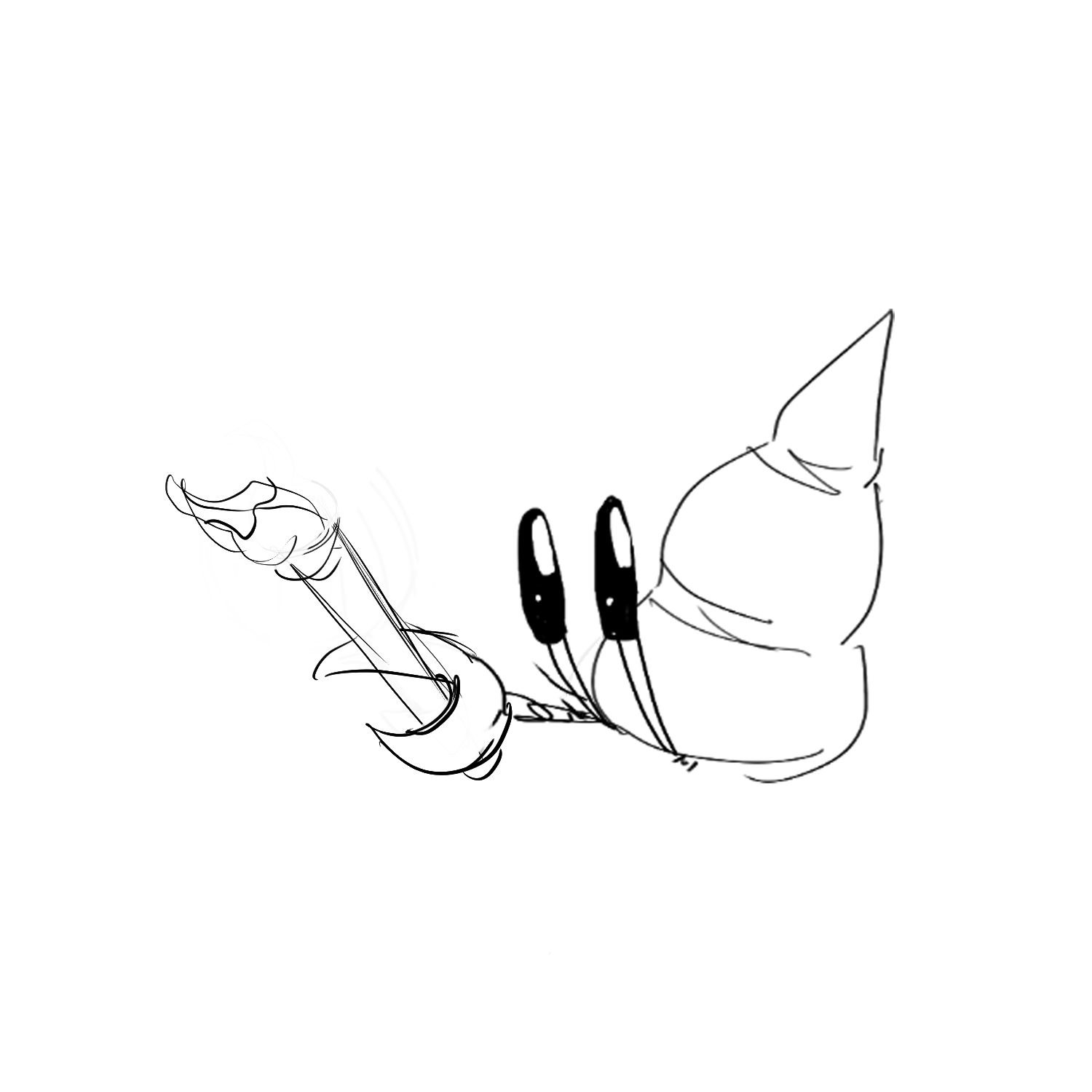
Type 5 - The Investigator
- Most likely to survive apocalypse
- Straight-forward
- Unique
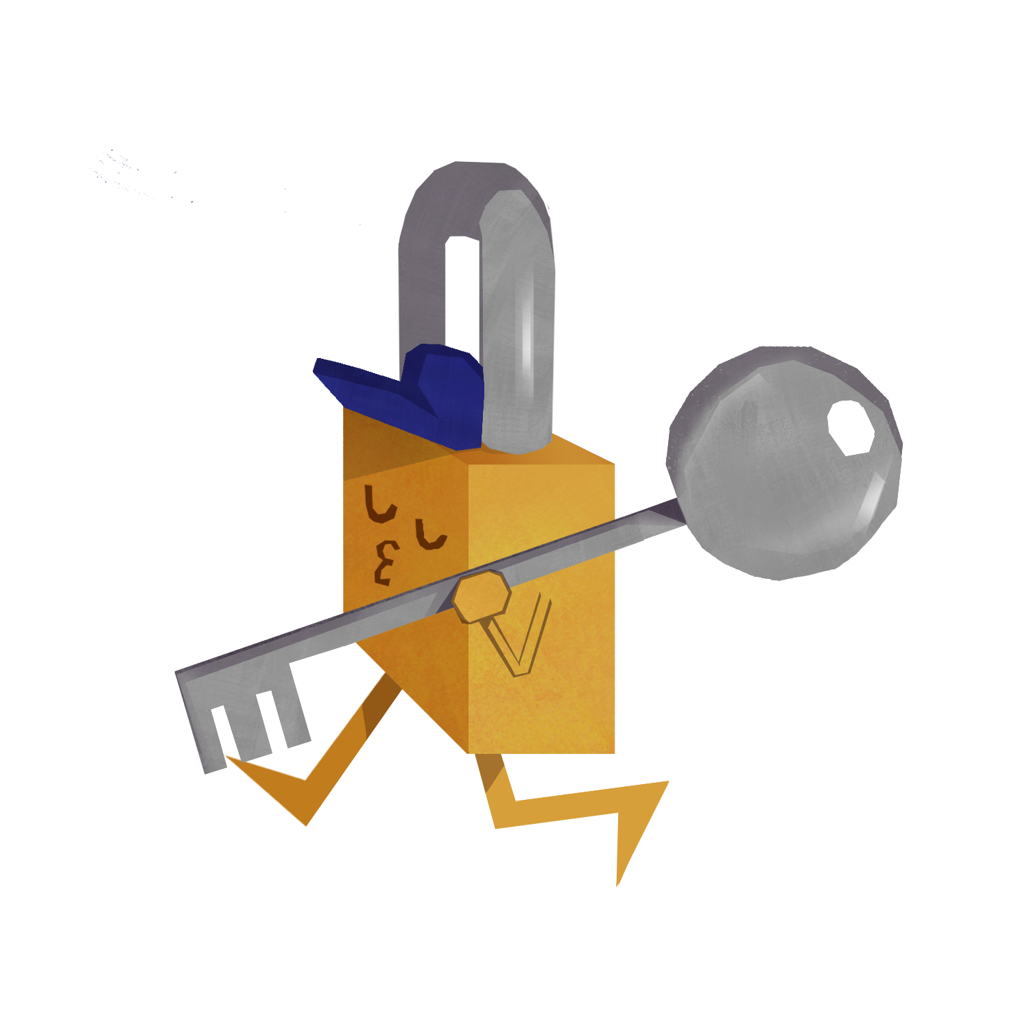
Type 6 - The Guard
- Meh
- Chihuahua
- how about we just leave?
- Has 20 back-up plans, and then 10 more
- mind reader
- team player
Type 7 - The Entertainer
- What was the homework?
- down to clown
- let’s go shopping!
- Protective of friends
- Protective of friends
- Loves to socialize with others
Type 8 - The Boss
- 20 step morning routine
- “we gotta get at least 10,000”
- #girlboss
- Amazing public speaker
- Can handle big dogs
- Always won at field day events
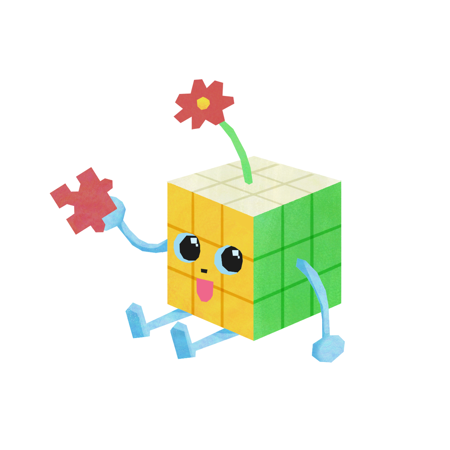
Type 9 - The Peacemaker
- do you want to try yoga?
- Empathetic
- “I understand both sides...”
- Always knows the best places to eat
- Good with Instruments
- Studious
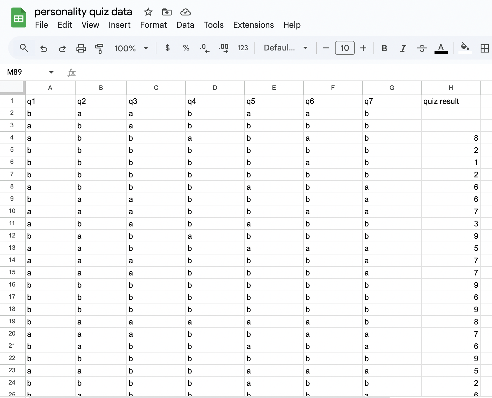
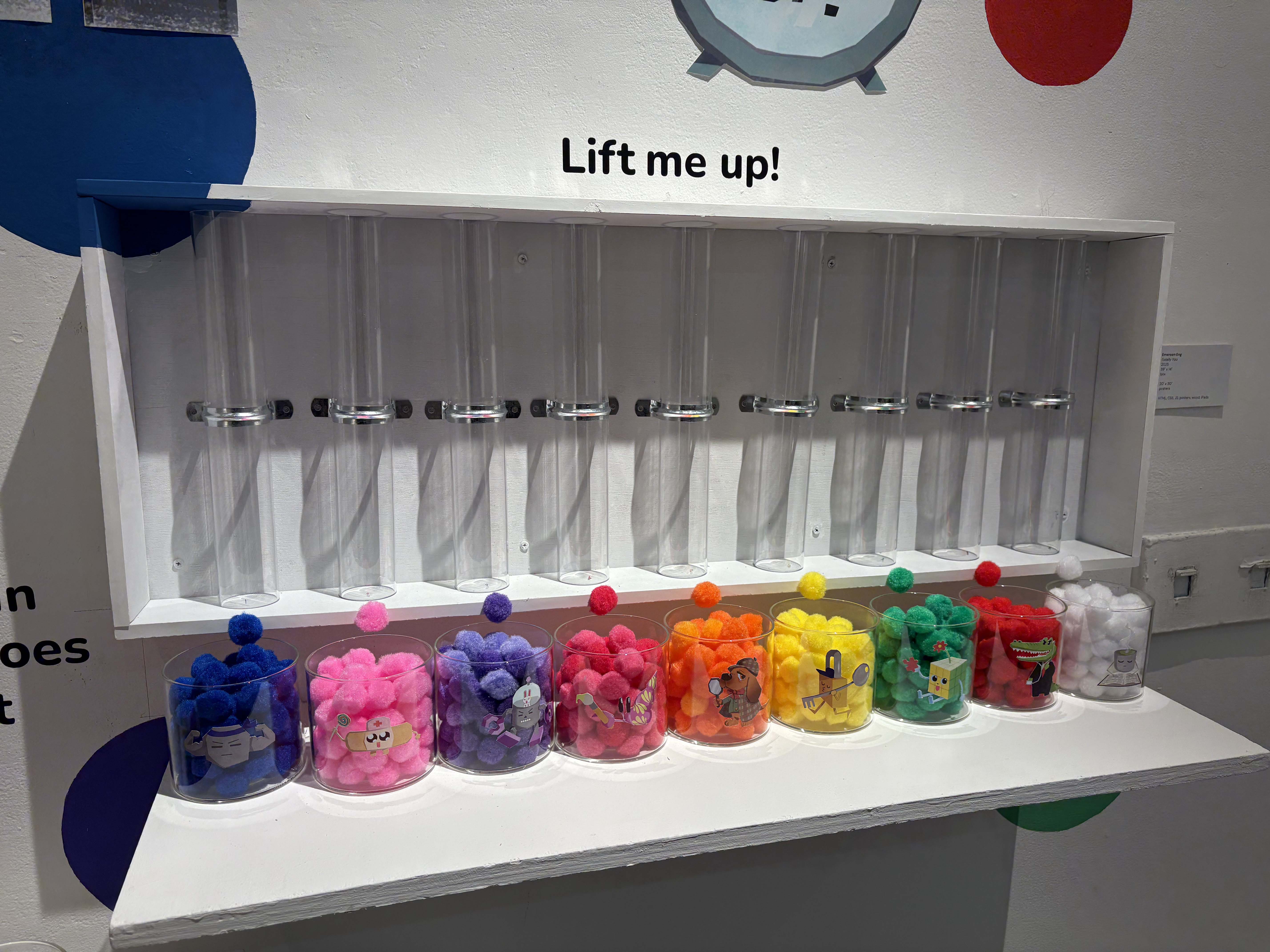
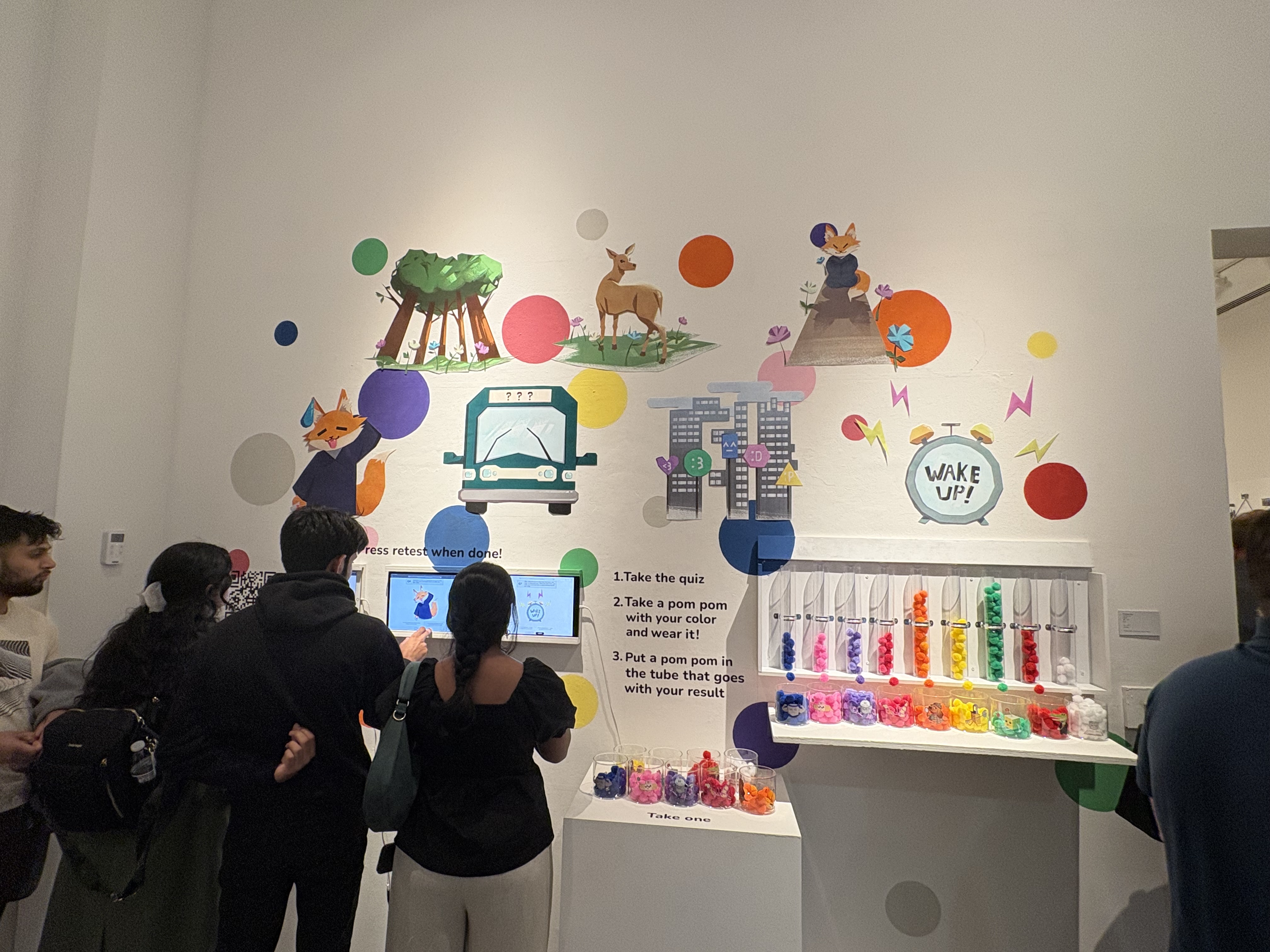
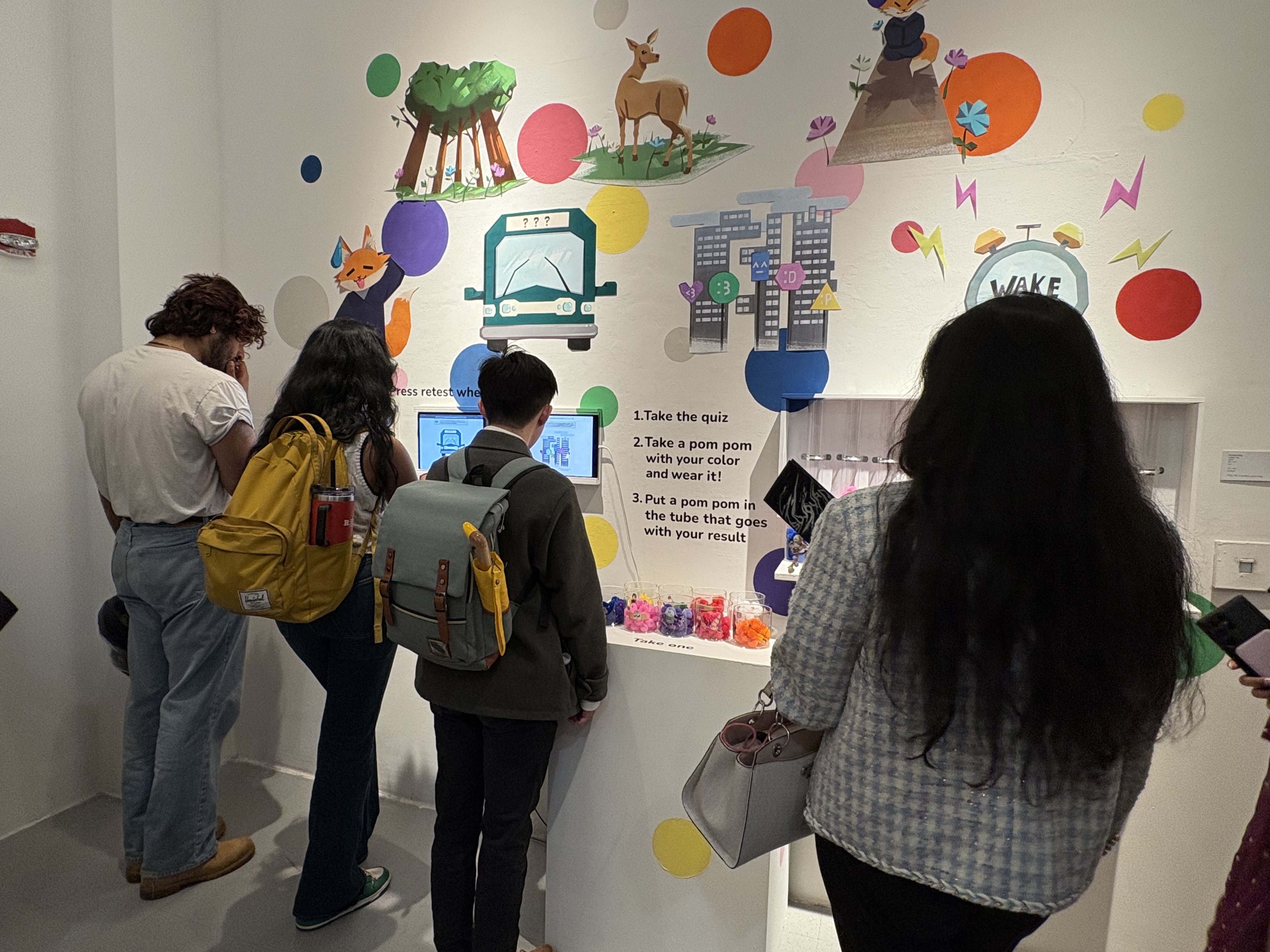
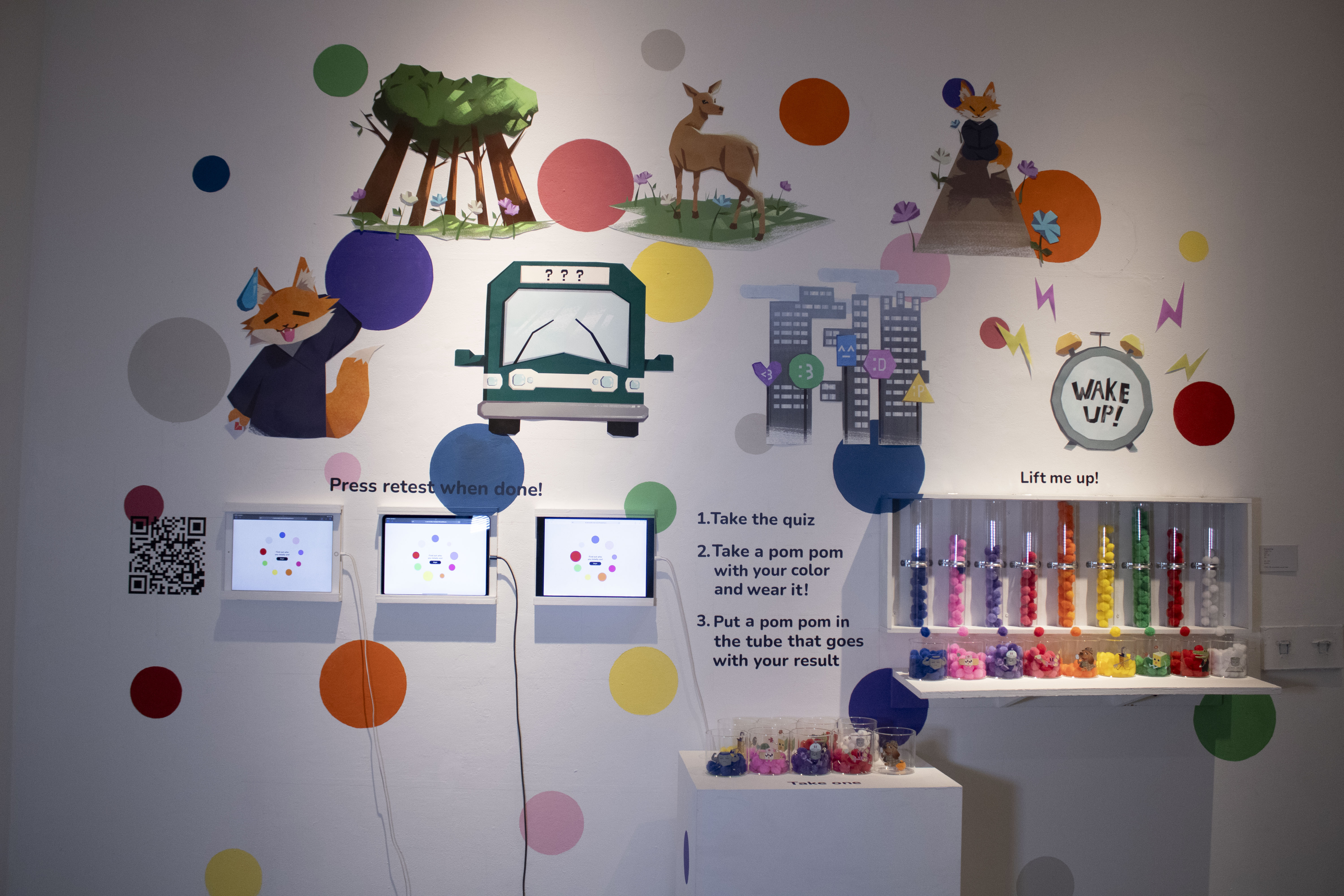
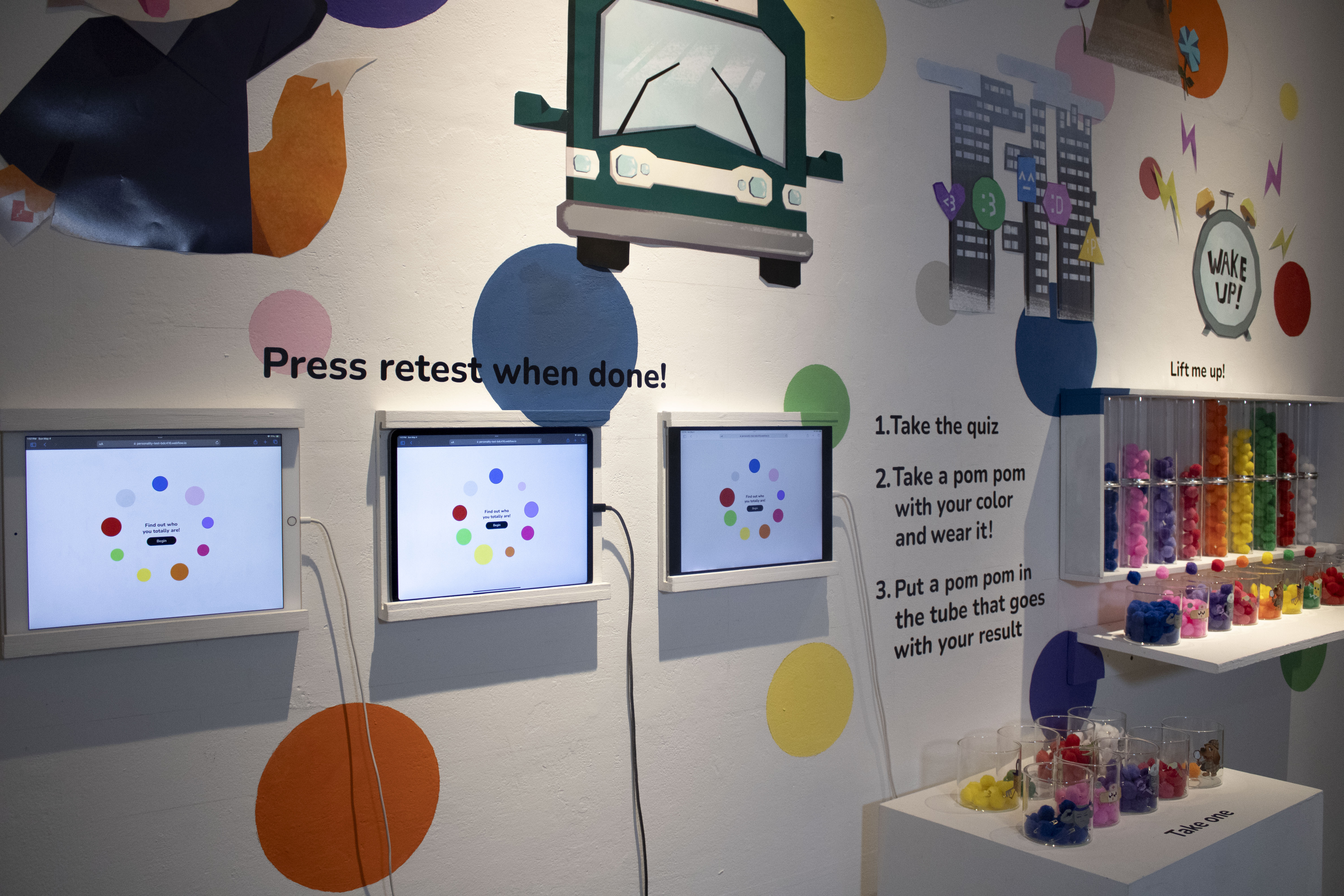
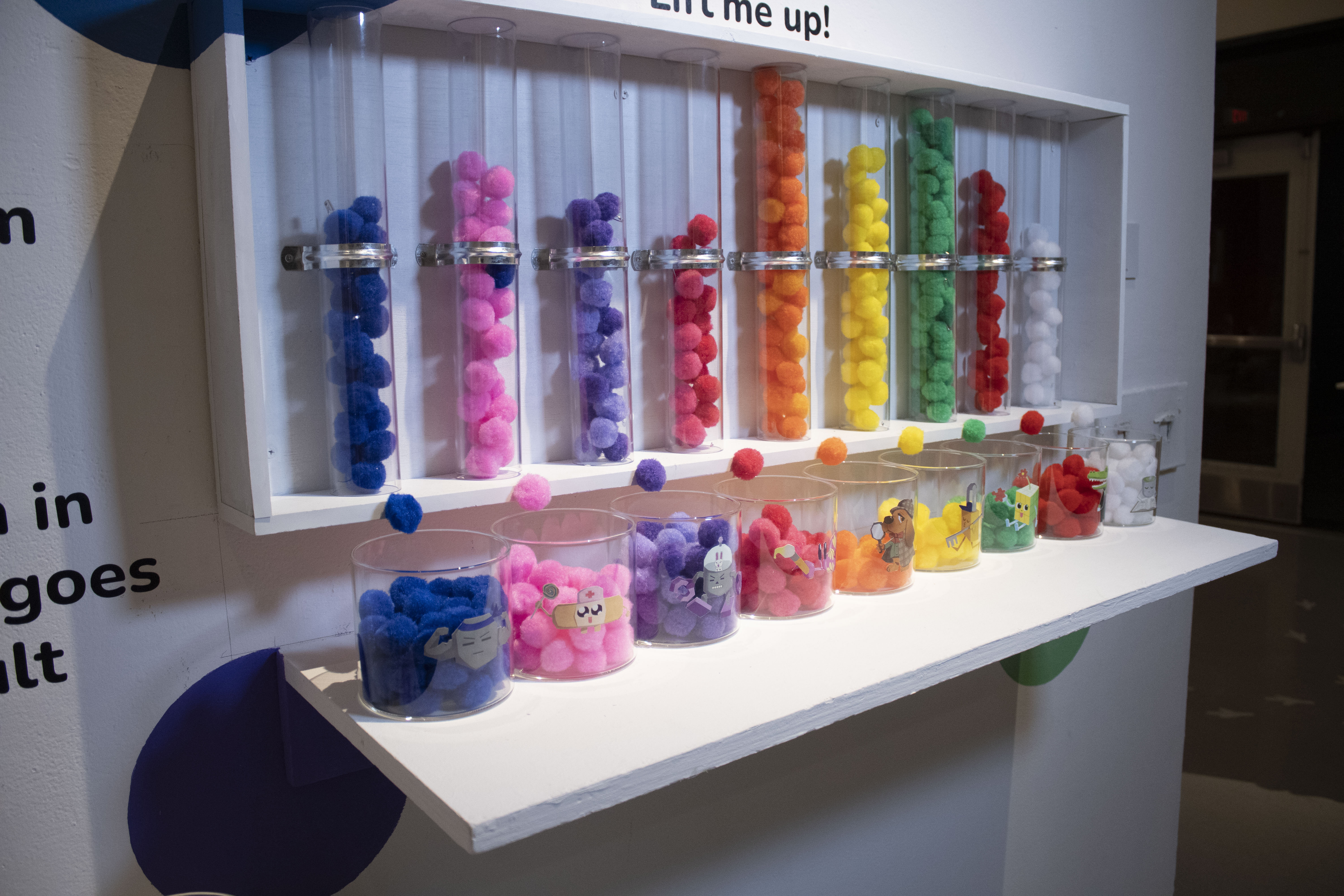
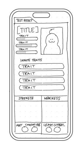
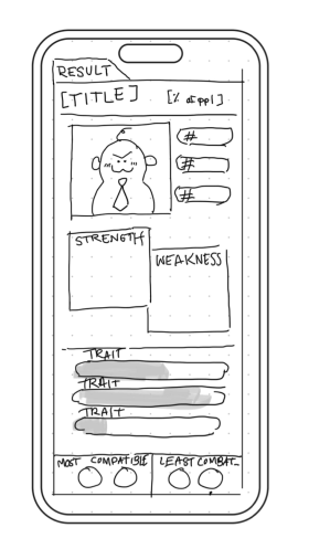
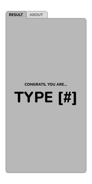
LO-FI ReSULTS
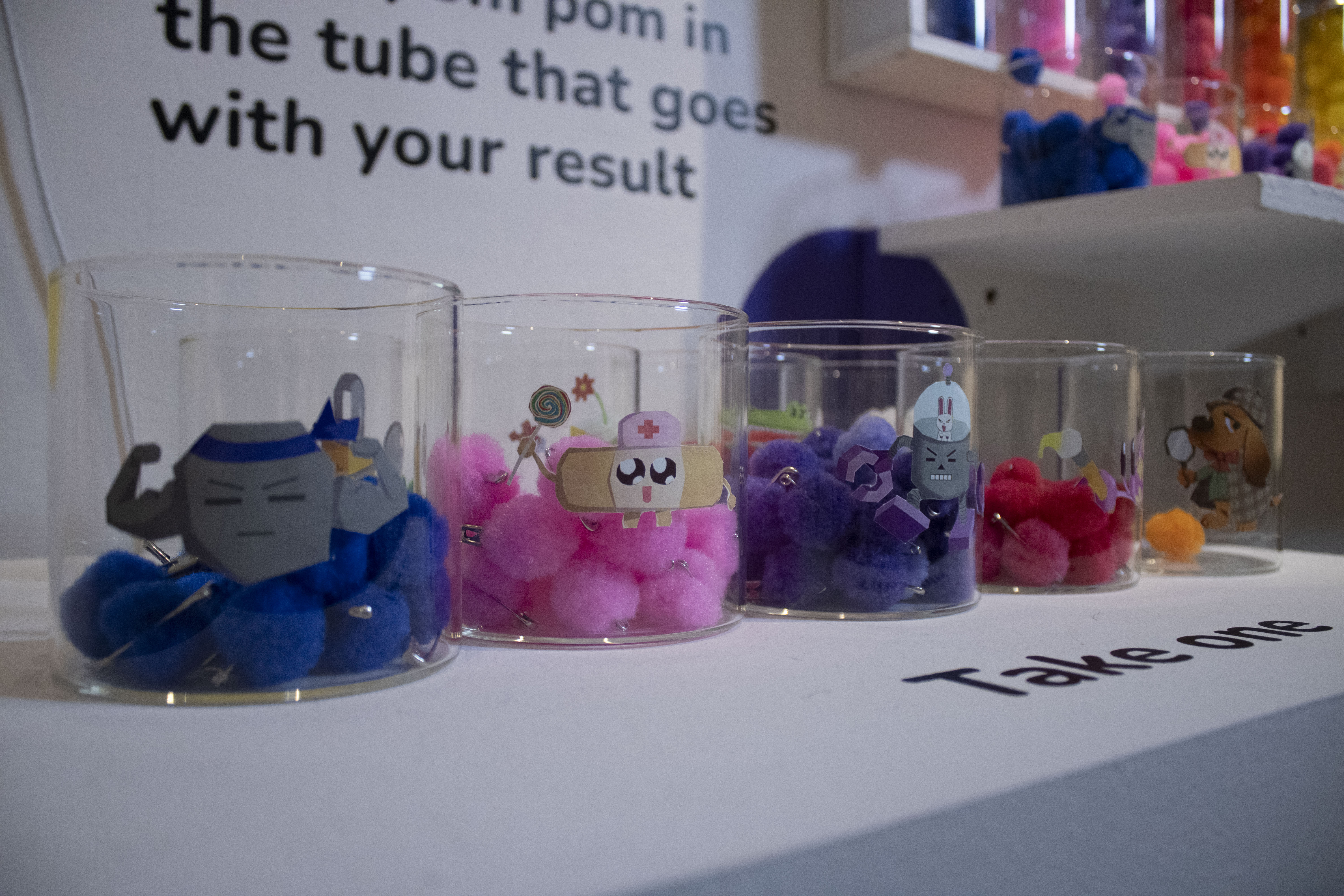
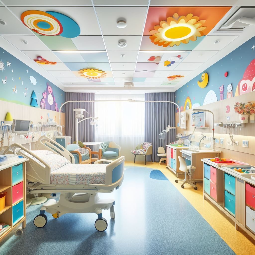
I wanted to make the results page clear and concise. Going back to the pediatric/ doctor theme, I wanted users to get a "folder" for the results. Below are some options for results for my quiz.
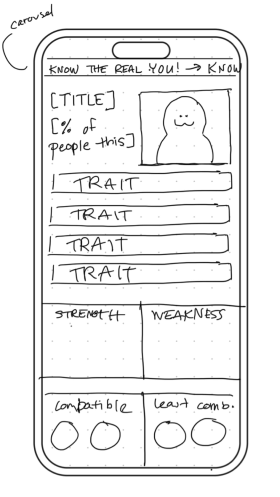
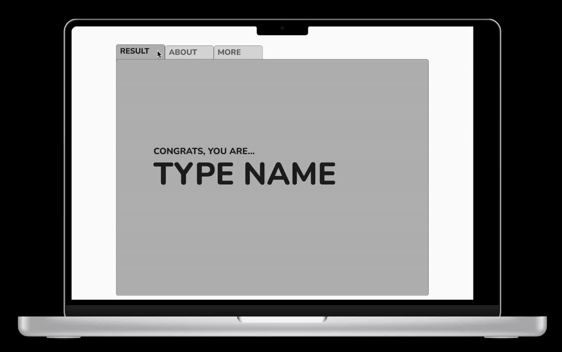
Mid-fi ReSULTS
Here are mid-fi designs for the results, experimenting with the tabs and layout. I had to make sure my designs were responsive, so I experimented with desktop layouts as well as mobile.
I wanted the result page as a recreation of a doctor's folder with a patient's results; there would be tabs at the top of the page where users could click between the different folder pages.
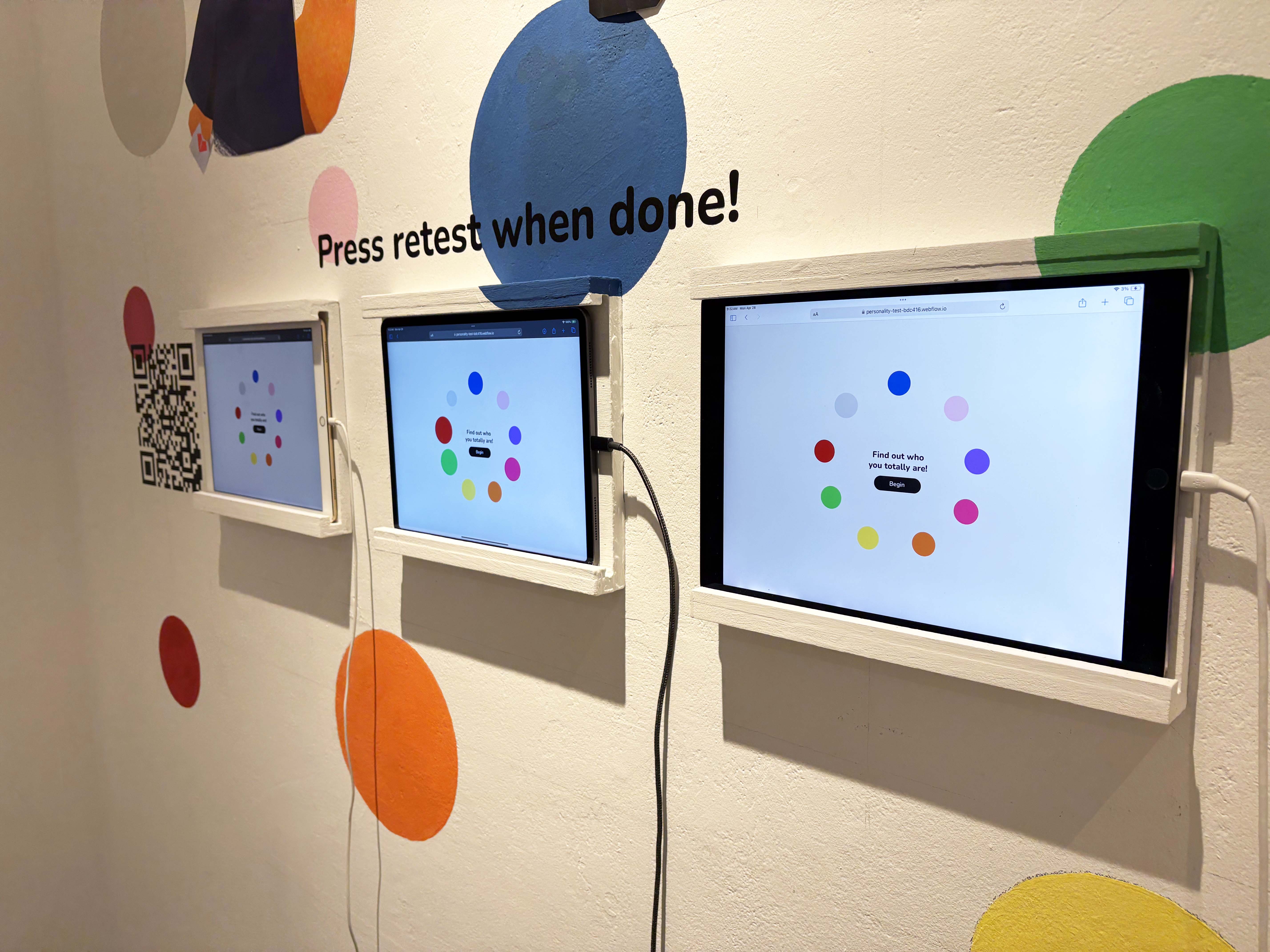
User Interface
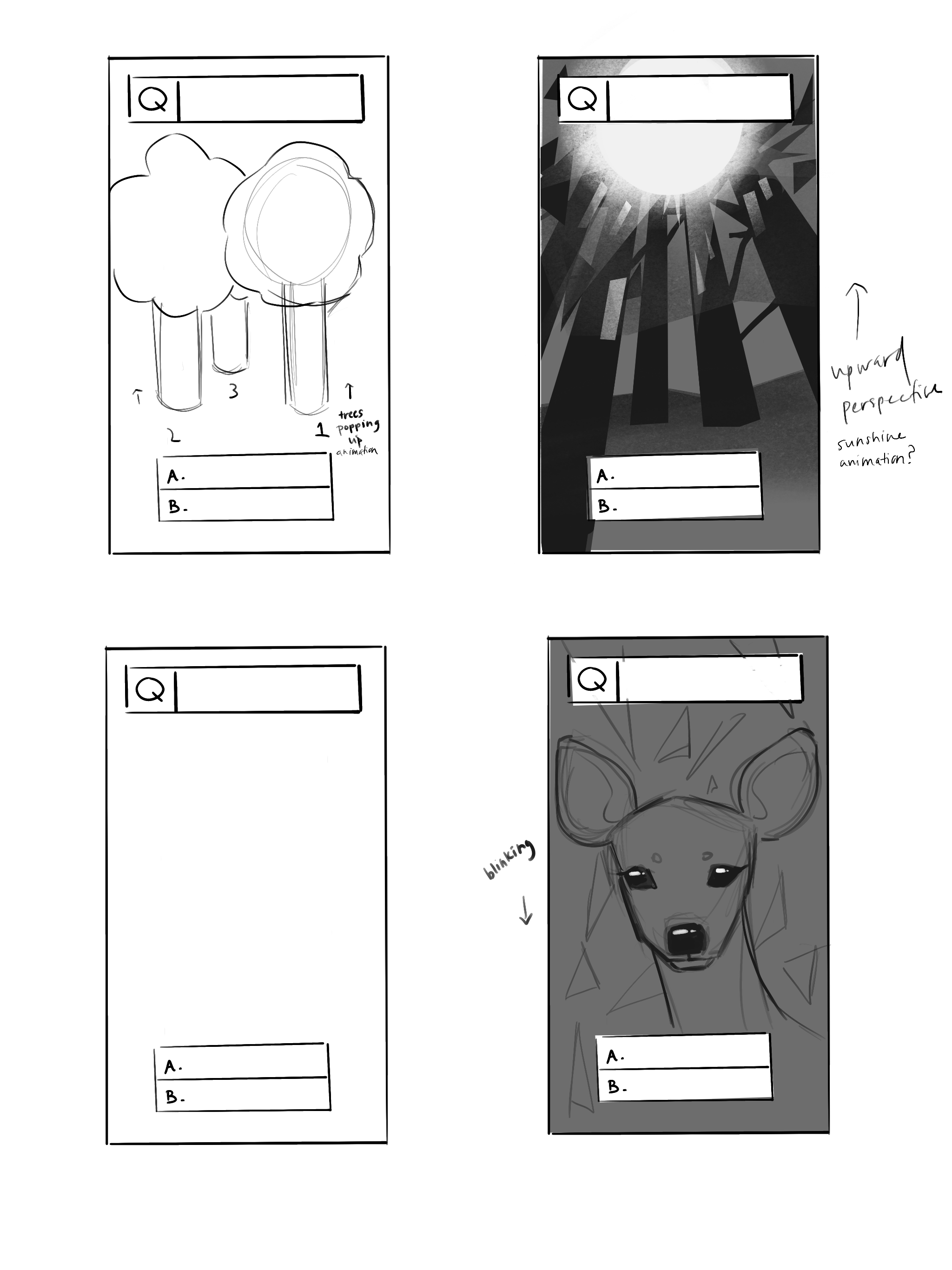
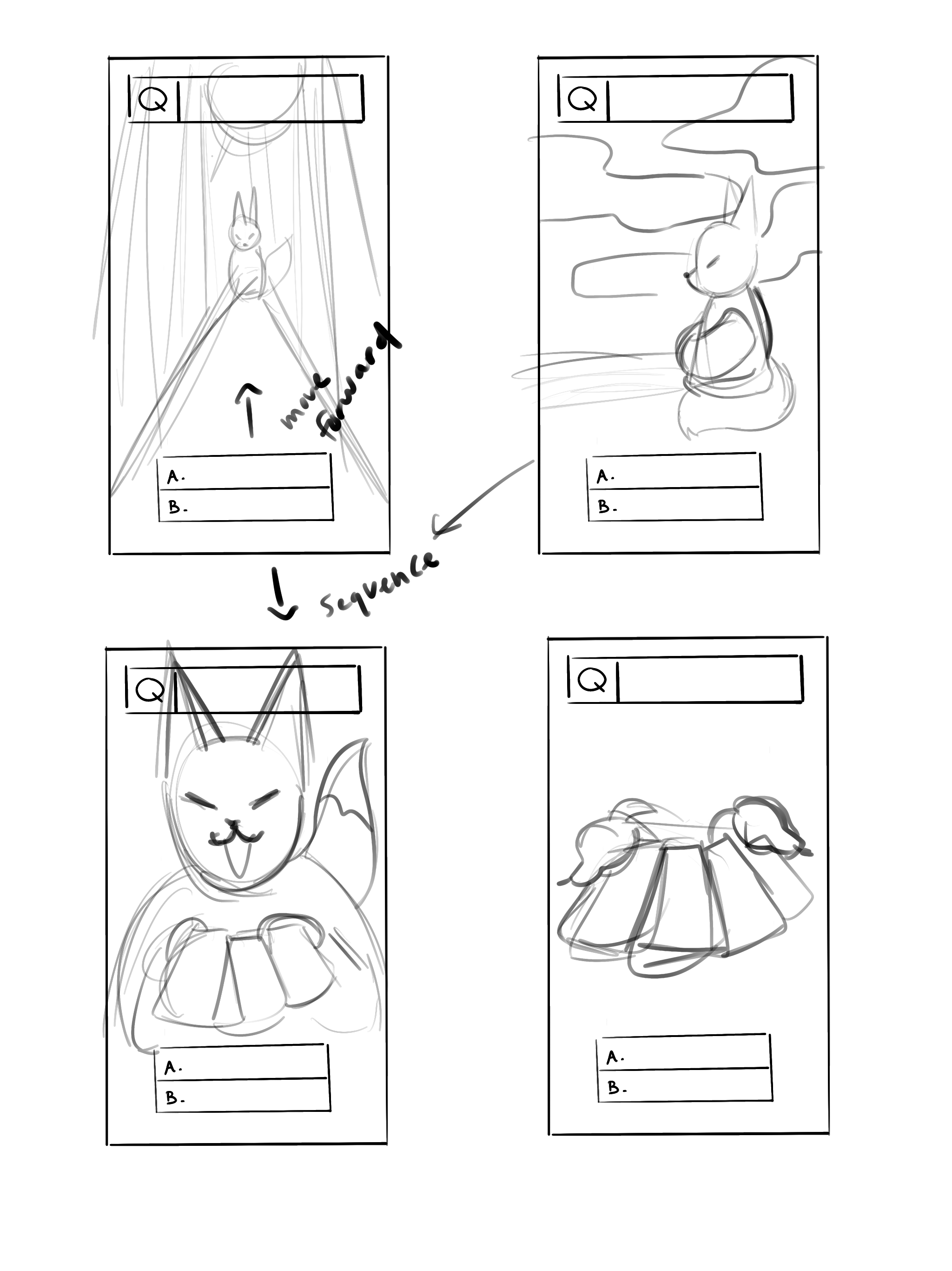
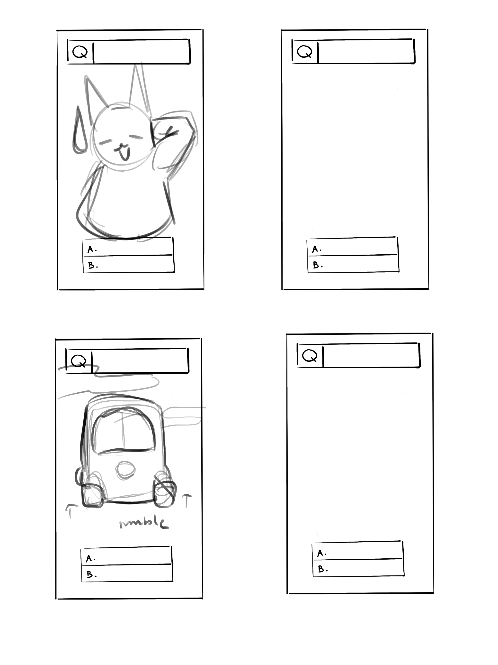
Sketches for my questions:
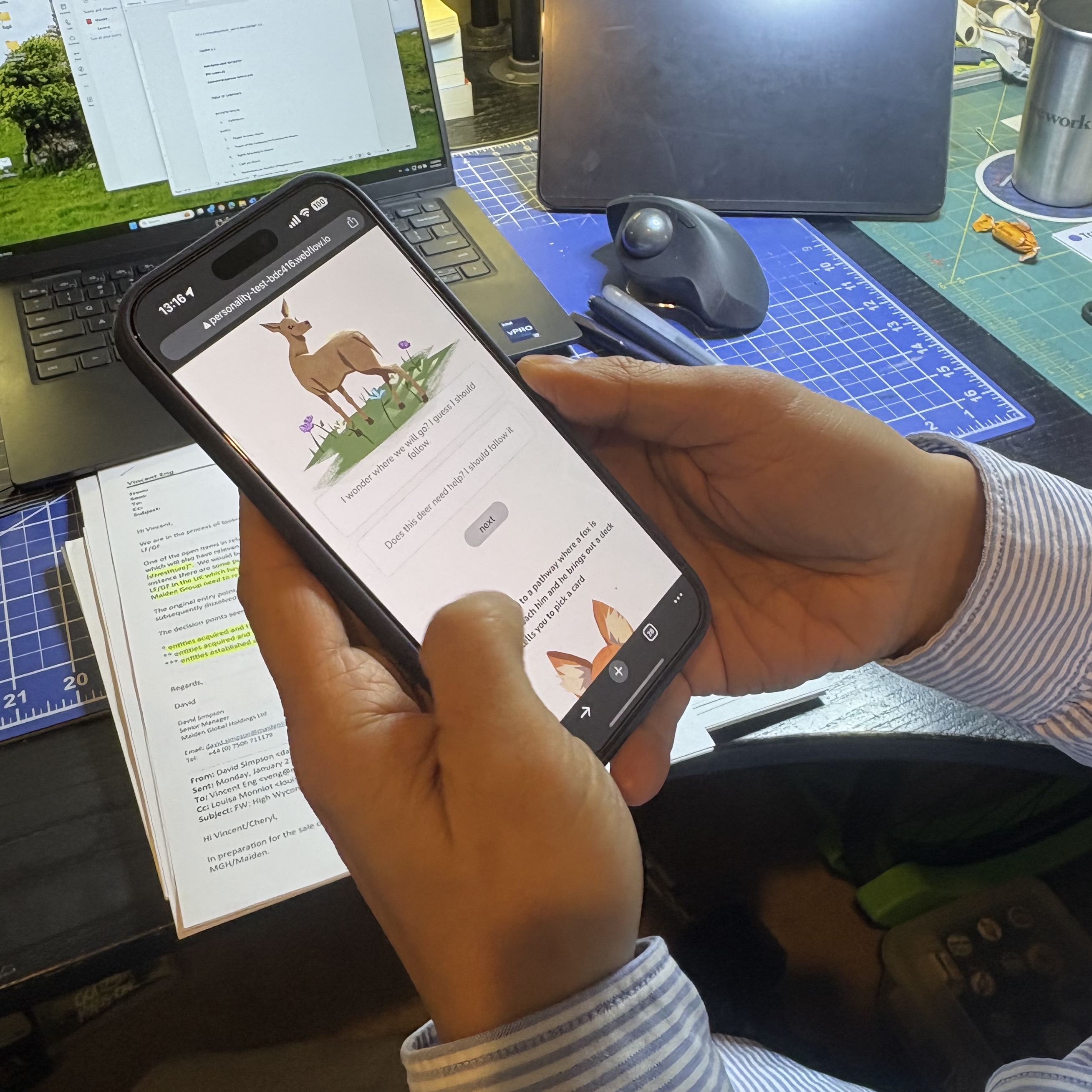
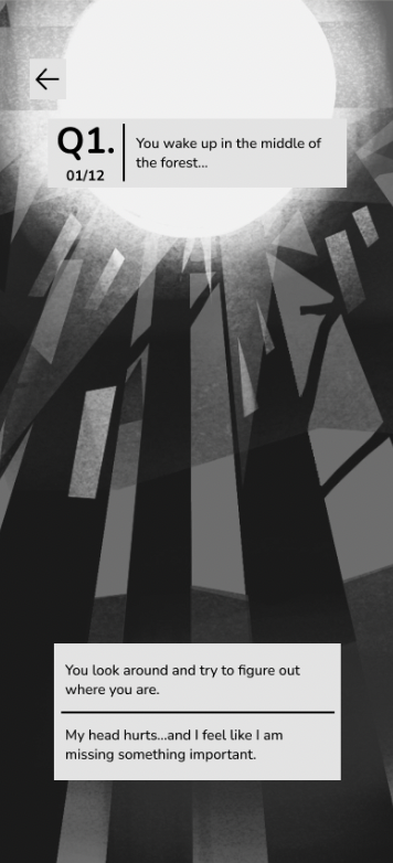
Example of Phone UI:
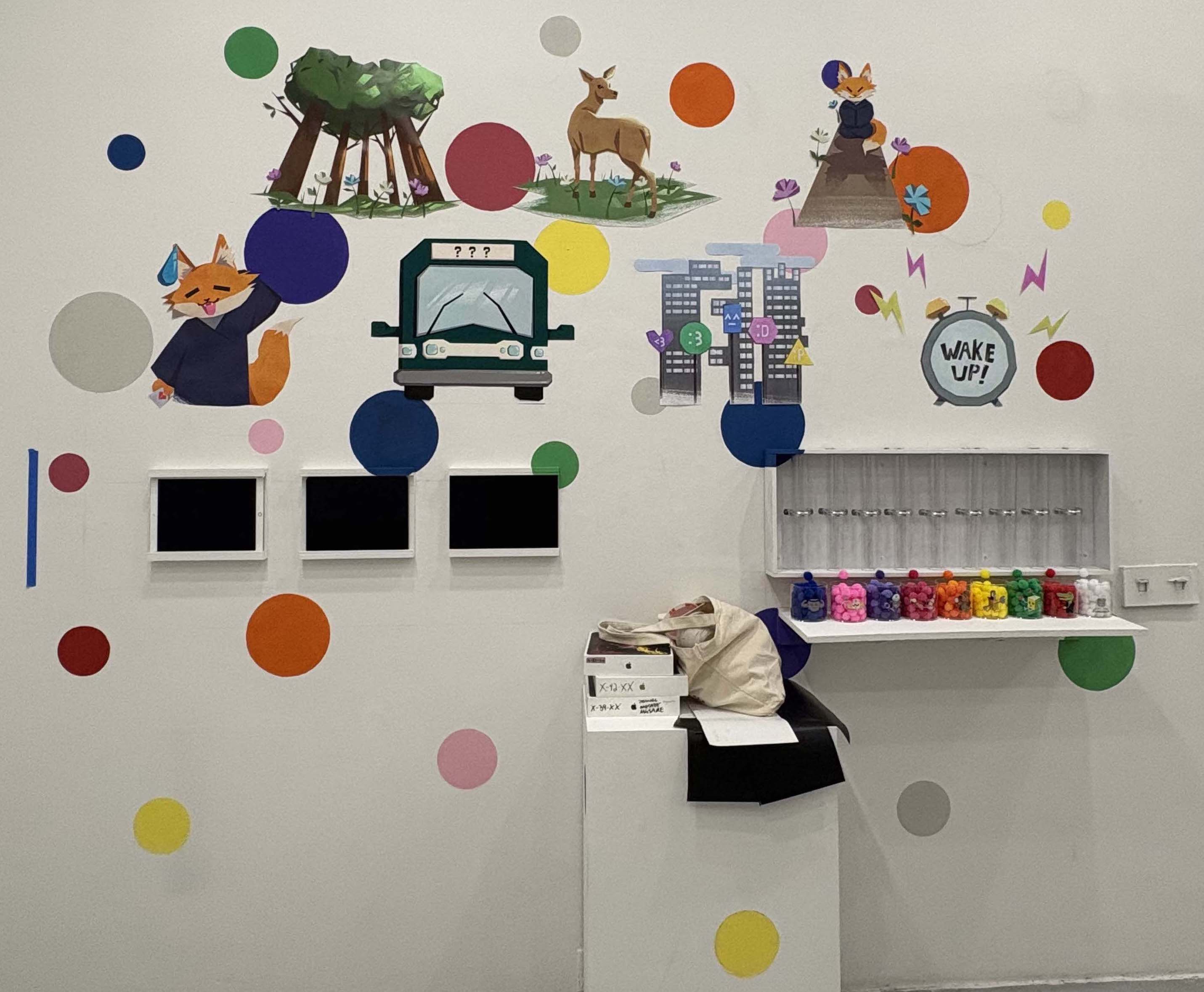
As mentioned previously, my quiz is based on enneagram. I needed a script for my test, aka questions that guided my audience through a tale. I knew that for each question I would have only 2 options for an answer. Each option would have a different personality result attributed to it. I based my questions around following a journey for my users, keeping them engaged for what happens next while having fun. Once I had this drafted, I tested the questions before even coding or developing my quiz.
First IDEATION OF QUESTIONS
I first had 12 questions, but I lowered it to 7. As mentioned before, I had people go through the questions before the website was developed.
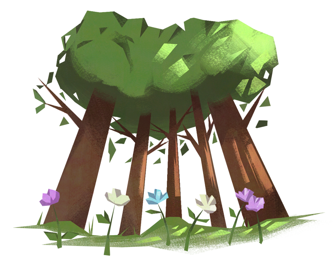
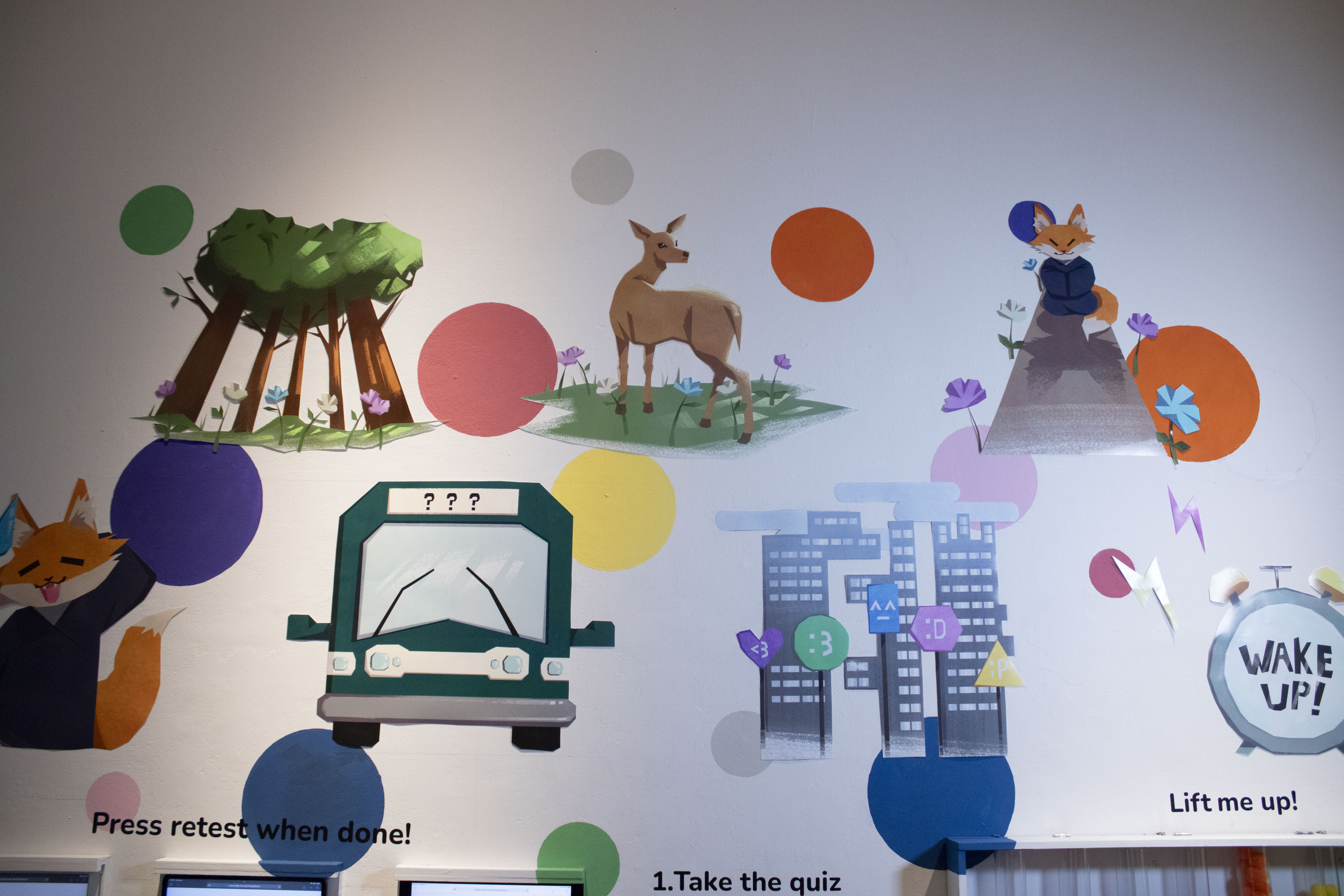
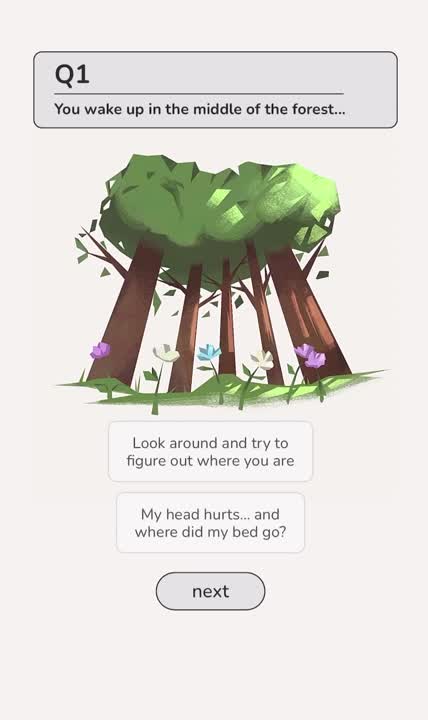
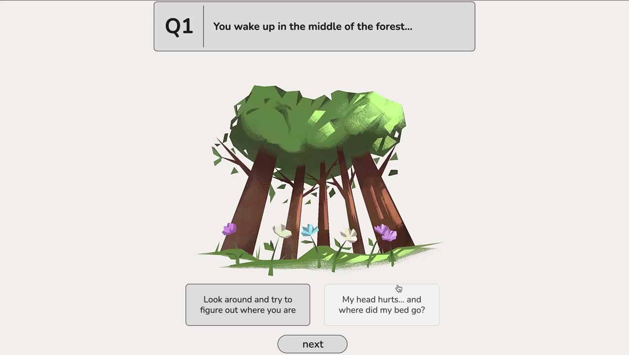
- You wake up in the middle of the forest
a. Look around and try to figure out where you are (type 5, 6, 7, 3)
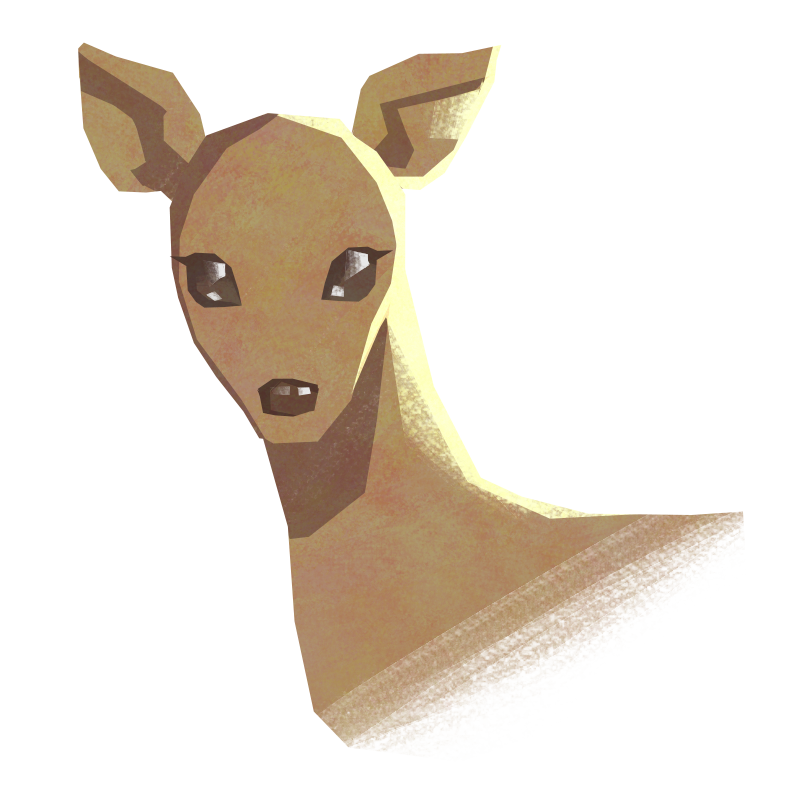
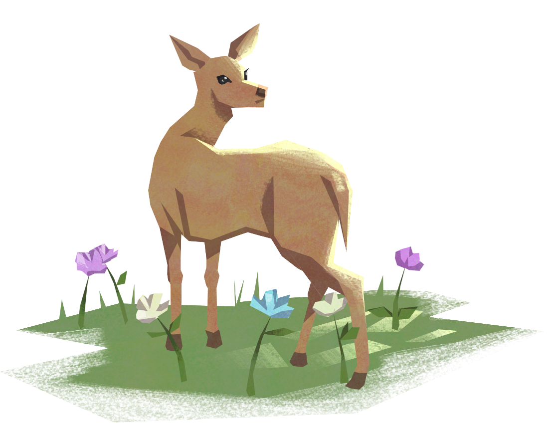
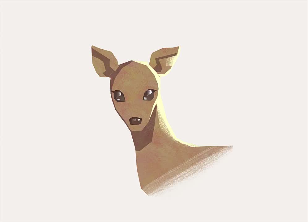
b. My head hurts…and I feel like I am missing something important (type 9, 2, 4, 8, 1) - You hear a noise and suddenly, a deer appears before you. It is staring and waiting for your next move. What is your first feeling?
a. Spooked, you clutch a hand to your chest. (type 4, 9, 6, 2, 3)
b. Curious, where did he come from? (type 5, 8, 7, 1) - The deer starts walking, looking back at you as if it wants you to follow. You decide to follow the deer, thinking to yourself…
a. I wonder where we will go? (type 5, 7, 8, 6)
b. Does this deer want my help? I should follow it… (type 2, 9, 4, 1, 3) - The deer takes you to a beautiful clearing with a gorgeous sky view. The forest you are in is almost otherworldly.
a. Wow… what a waste of time… and none of my questions are being answered! (type 1, 8, 5, 6 )
b. Wow… it is so gorgeous here…where is my phone to take a photo? (type 4, 9, 7, 2, 3) - You see a fox sitting in the clearing, and you approach him. He brings out a deck of cards and tells you to pick a card
a. You go for the one in the middle: front and center as you want to be (type 1, 3, 7, 8)
b. You go for a card on the side, preferring to be a fly on the wall (type 2, 4, 5, 6, 9) - He tells you that he has been practicing his magic tricks and was excited to test it out, but forgot what to do after you pick a card
a. Advise him that he should practice a bit more before asking strangers to do his tricks (type 1, 3, 5, 8)
b. Laugh and tell him that it is okay and that you enjoyed the trick anyway (even if you are lying) (2, 4, 6, 7, 9)
- A bus comes driving through the clearing, stopping in front of you and the fox
a. Ask if he needs help onto the bus (type 1, 2, 3, 4, 9)
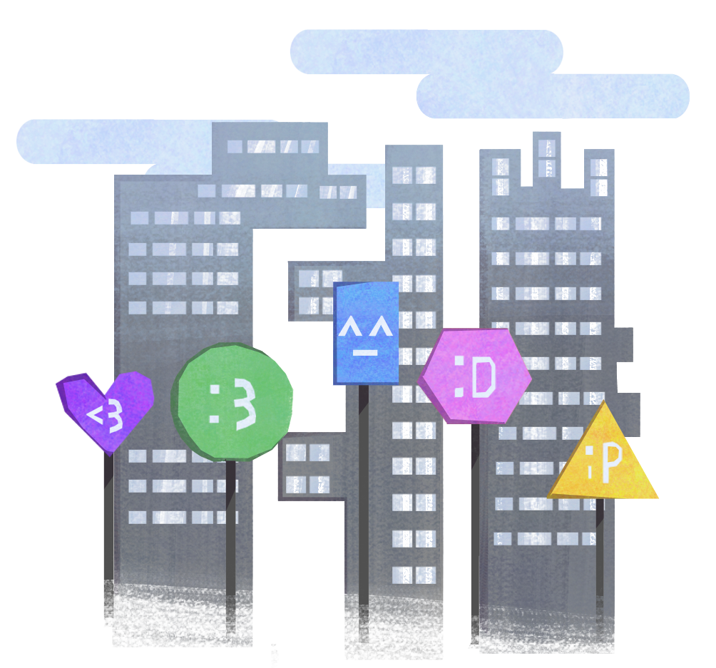
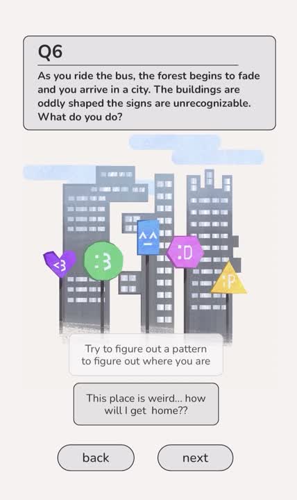
b. Look at the bus and try to see who is inside (5, 6, 7, 8) - You get on the bus, notice the forest is clearing out, and arrive in a city. The buildings are peculiarly shaped, and the language on the signs makes no sense to you. What do you do?
a. Try to figure out a pattern and see if you can figure out where you are (type 2, 4, 5, 7, 9)
b. This place looks weird… are we supposed to be going somewhere? (type 1, 3, 6, 8) - The bus stops, and everyone files out, including the bus driver. What is your next move?
a. Where is everyone going? I better get out and see what is going on!! (type 1, 3, 4, 7, 8)
b. Maybe I should stay and wait… something might come up (type 2, 5, 6, 9) - Before you can get out of the bus, a tiger walks on. How do you react?
a. WHAT??? WHAT DO I DO??? WHERE DID THIS TIGER EVEN COME FROM?? (type 2, 3, 4, 6, 7, 9)
b. Look around for a weapon!! Look for an escape!! (type 1, 5, 8) - The tiger pounces and opens its mouth…
a. Your life flashes before your eyes, and your final thoughts are, “I could have done so much more if I just didn’t stare at walls all day” (type 2, 3, 4, 5, 7)
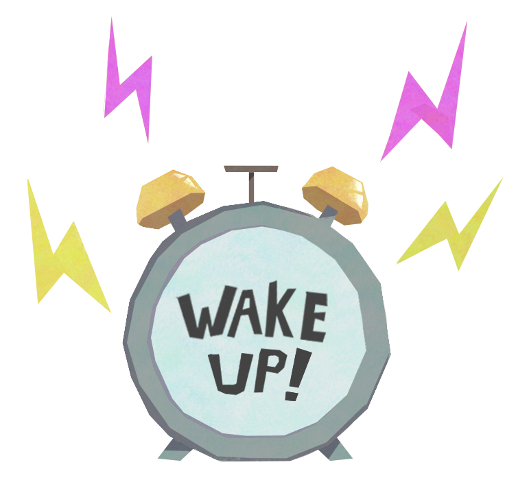
b. Shit… there has to be a way out of this! (1, 8, 9, 6) - You wake up to your alarm clock blaring and the sun blinding your eyes
a. What a cliche ending… (type 7, 5, 6, 4)
b. What a strange dream…I guess I need to start the day now (type 1, 2, 3, 8, 9)
These questions were too long, unclear, and unintuitive. I later changed them as I did more usability testing.


.png)


.png)